The Future of Political Campaigns: A Unified 1st-Party Digital Ecosystem
The standard approach to political websites and campaign digital infrastructure is no longer enough. It’s time to embrace user-centered digital experiences in order to cultivate deeper relationships with supporters and voters.
This is the next-generation digital strategy framework for political campaigns — consolidating all native functionality to provide campaigns of any size the tools they need to optimize every aspect of their operation.
Voters, volunteers, and donors want to feel valued and respected, engaged and inspired. We can’t ignore the power of technology, user experience design, and great creative to command an audience’s attention, foster belonging, and facilitate action. We’re leaving so much on the table by simply outsourcing user actions to 3rd-party platforms. It’s time to embrace more user-centered design thinking and creative problem solving to tackle the challenges and opportunities faced by the whole of the campaign.
SIDE NOTE: I’m happy you’re here, and you’re certainly welcome to read this page on a mobile device. But for the best experience, check it out on a computer if you can. There are laptop mock-ups to display the website features, but on this device they have been replaced with mobile mock-ups because of the screen aspect ratio.
TL;DR
Currently, political campaign websites are designed to merely be a proxy, with the objective of sending users away to 3rd-party platforms. But, it’s possible to build a website to be an all-in-one digital hub for strategic operations, unifying all the tools that campaigns need, including forms and donation processing, event organizing, and e-commerce. Let’s be real— there are some major downsides to using 3rd-party platforms like ActBlue and Mobilize, and digital strategists who are data-driven and results-oriented all know it. Of course, it’s easier to embrace the existing digital ecosystem rather than building a custom website with all of this native functionality. However, it doesn’t allow campaigns to run a fully optimized digital operation and provide users with a coherent brand experience. This new approach gives the campaign complete control over their users’ experience; for example, the ability to implement custom branded email automation to make the most of every action a user might take on the website.
The future of the internet and digital marketing is all about personalized engagement using first-party data. This new framework helps to grow and enrich first-party data, and empowers campaigns with the infrastructure necessary to run an effective multi-channel digital strategy. Converging all user traffic to a single web property configured with enhanced action-oriented analytics tools allows the campaign to better optimize ad campaigns, email, and content strategy, saving tremendous amounts of money and boosting overall performance metrics.
Before you check out the demos below, allow me to personalize them for you. What’s your name?
Hi , welcome!
JUMP TO SECTION
And payment processing!
No 3rd-party Forms
In addition to the forms on landing pages such as the “Donate” or “Get Involved” pages, you might notice the donate form on the homepage. These are all native inline forms, not just a set of buttons linking to a 3rd party website like ActBlue, or an iframe-embedded form hosted on a different server. Pre-configured form modules can be placed on any page, making it easy to add any kind of custom landing page to the website. And of course, any new custom forms can be created for any purpose, if an existing one doesn’t have the necessary input fields.
Some features include, but are not limited to:
- Native integration with basically any CRM/ Email Service Provider, and other apps like Slack, Twilio, Help Scout, and more
- Integration with any API via webhooks. For example, custom CRM, SMS, or even VoteBuilder actions (like adding to or editing a person’s data object, or adding them to a list and/or segment)
- Payment processing via Stripe for donation forms (Better than ActBlue— access funds faster, and lower processing fees.)
- Create custom polls and surveys
- Custom automated emails for users and admins
- Conditional logic for anything, like conditional form fields, automated email content, or webhooks
Making the most of hard-earned traffic.
There are plenty of good reasons not to drive visitors away to a different website just to fill out a form. It’s better for analytics, conversion tracking & optimization, and it’s just an overall better user experience, maintaining a consistent visual identity. Also, by keeping the user on the website, we can keep providing them with suggestions about something else to do or other pages to visit, even (especially) after a conversion.
For example, this “Thanks” page redirect (after a donation is made) gives the user the option to activate their user account, if they’re not already logged in to an account (more on user accounts below). Keeping the user on the website also means we can create pages with personalized dynamic content by passing data through URL query string parameters, as I’ve done to include the user’s name on the “Thanks” page, as well as suggesting a username for them.
Making it easy for users to take action.
Also on that page, there’s a section offering yard signs. The user’s data is also passed into this form, auto-populating hidden input fields. So, they can request a yard sign with one click after making a donation. That form submission gets sent separately, and triggers a different automated email. This can be extremely useful in many ways, so it’s worth showing another example of using custom dynamic content.
This landing page to request a yard sign is another instance of using query string parameters to inject dynamic content. When a user fills out this yard sign form, the “Thanks” page not only has the personalized confirmation message, but also a donate form (a non-paginated version), with the user’s info automatically filled in with whatever they entered on the previous page. All they have to fill in is a CC number, occupation, & employer. Of course, the idea here is that if you minimize the barriers between the user and the conversion, you’ll increase the conversion rate.
That data also gets plugged into the automated email, with the links in the email also using query strings for personalized pages and other forms that also dynamically populate the input fields.
Every campaign website needs maps. Whether it’s to show the boundaries of a district, locations of your field offices across the state, or anything else that might be useful. These custom Google Maps blend seamlessly into the page by styling the map’s features using the brand colors. Of course, the markers and info windows are also customized, as you can see with the polling booth and ballot dropbox icons on this map showing all the voting locations in the city. Another example can be seen on this blog post, where I made a map of city-wide public school lunch service during Covid closures.
In addition to custom map markers, there are also custom UI buttons, providing the user with straightforward zoom, fullscreen, and geolocation controls. It’s no more or less than is needed for the map’s specific purpose. The same map styling is also used on the Events Map View page.
With ticket sales, and more!
This website’s custom event organizing features are unlike anything being used by other political campaigns. While Mobilize.us seems to be the industry standard for Democrats (who can afford it), I believe a native events organizing platform like this can deliver much better results than a 3rd party service like Mobilize. I will also mention this— There are some individual state party organizations and state-wide campaigns spending over $100,000 a year on Mobilize, for less capable functionality and suboptimal UX. The DNC and presidential campaigns each end up spending much much more on Mobilize.
Surely, Mobilize has been a fine option among no other good options. But I believe there’s a better way, one that doesn’t rely on outsourcing your user traffic to 3rd-party platforms. While I’d love to get into the weeds about all of the strategic considerations & implications, for now I’ll just stick to pointing out the core events features designed for this website.
There are two main views— a List View and a Map View. I’ve set up a few demo events using some of the different options, such as Virtual Events, Recurring Events, Featured Events, Tickets, and RSVP. There are some more specific details about each on the individual event pages.
The ticket sales feature is great for fundraising events, whether they’re virtual or at a venue (whenever those happen again). For in-person events with RSVPs or tickets, the ticket email includes a unique QR code. At the event, the attendee checks in by getting their QR code scanned from their phone. Likewise for virtual events, Zoom or livestream links are sent to registered attendees in RSVP or ticket emails, as opposed to posting the link publicly. Requiring RSVPs to free events is a great way to build email lists.
Event tickets are sold using the e-commerce platform’s cart/ checkout process, which I’ll talk about next.
Like the events features, this is also groundbreaking— literally no other campaign website has anything like this. Sure, not all campaigns are going to sell a ton of merch. But, most don’t even bother trying. It’s typically just not worth it, going to the trouble of setting up a separately hosted online shop like Shopify, or having a 3rd-party handle everything, like some bumper sticker company in Austin TX, for example. The profit margins end up being thin, fulfillment is slow, and it doesn’t bring a lot of value to the campaign overall because somebody else gets to be the middle-person between you and your supporters. It’s a wasted opportunity.
This is a better way of doing an online campaign shop, with full e-commerce functionality built right into the campaign’s website. This makes it easy to manage products and fulfillment locally. It’s simple enough that shop management could be delegated to interns, but also sophisticated enough for larger campaigns that might even bring on consultants or a design agency to handle the product design & production (and perhaps also marketing & customer service). Anyone taking on these tasks can be given limited admin access to the website as a “Shop Manager” (more on admin user roles below).
This website has all the features that the campaign needs to operate their own online campaign shop. For example:
- Premium marketing automation, including features like dynamic coupons, refer-a-friend, follow-up emails, abandoned cart remarketing, etc.
- Fulfillment features such as local pickup, custom shipment options, shipment tracking, and invoice/ packing list/ shipping label printing.
- Front-end product features like quick view, inventory management (i.e. notifications on a product page like “Only 2 items left!”), pre-orders, dynamic Apple Pay/ Google Pay buttons, and more.
- Enhanced e-commerce analytics and integration with digital advertising platforms like Google Ads and Facebook.
- Event Ticket Sales (Integrated with the Events Platform)
Consider this potential use case— A campaign could not only configure local pickup options for their HQ office or field offices, but also list upcoming events as options for “local pickup.” This way, when someone RSVPs (or buys a ticket) for an event, there could be a section in the confirmation email about campaign merch for sale, available for pickup at the event. Then, when the user checks in at the event by scanning the QR code in their email, that would immediately trigger another email welcoming them to the event with any relevant info, and also a reminder to visit the campaign website to buy some merch and pick it up right away at the event’s merch table.
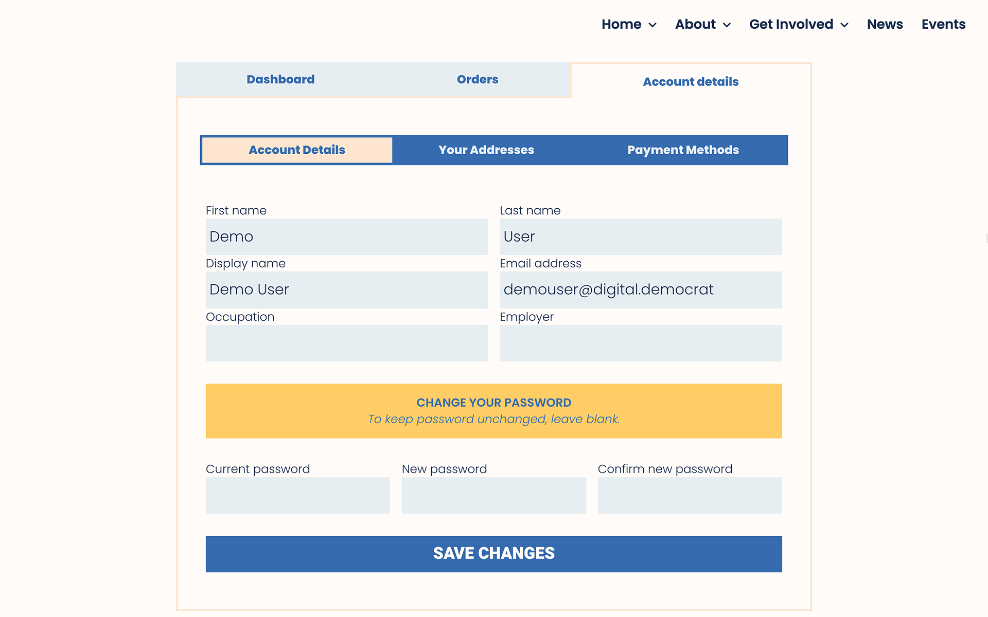
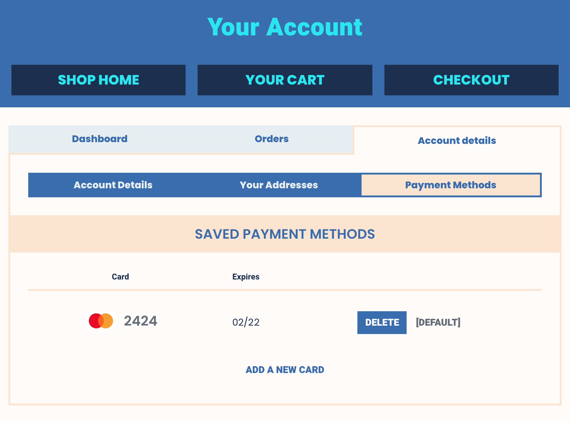
Take a look around the shop pages, perhaps add something to the cart to see the cart and checkout pages. You’ll also notice how the shop pages are seamlessly integrated into the website by keeping the design and color scheme consistent. If you’d like to log in to see the user account pages, I’ve set up a demo account for you. If you don’t want to bother logging in, here are a couple of screenshots of those pages.
When you make a donation on ActBlue, you get a confirmation email from ActBlue. When you sign up for an event on Mobilize, you get emails via Mobilize. This might be a simple and easy way of doing business if you don’t care about interacting with your supporters. But as I’ve been saying, it’s an opportunity to engage with the people powering your campaign, and not taking advantage of it is a strategic blunder.
Making a Statement with Branded HTML Emails
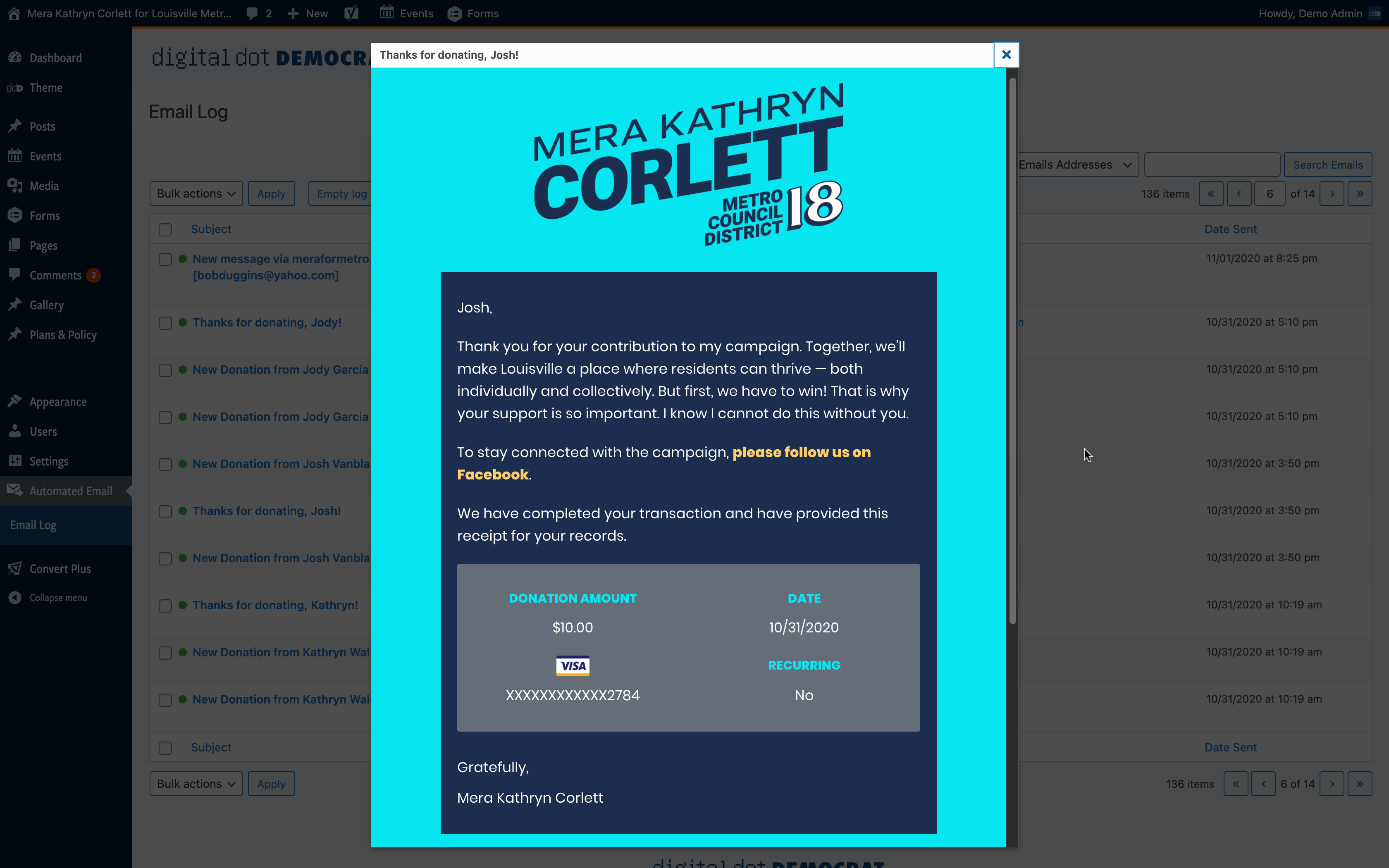
Email can be an effective tool to strengthen the campaign’s brand identity. Just like the website, social media content, and print materials, email design should also adhere to the campaign’s brand guidelines. By having control over the design and content of every automated email, each bit of copy becomes a chance to craft the campaign’s voice and advance strategic objectives.
Side note— my custom HTML email markup is light mode /dark mode enabled! Because I’m a big email nerd.
“The Emails are Coming From Inside the House”
Make no mistake, this email automation is very much a part of the website— it’s not just being triggered and sent from some other email platform (although, you can also set up automations with your email service provider (ESP) — like a drip series, or emails triggered when a subscriber gets added to a list or segment). For these single-send auto-responder emails, the PHP code that generates the emails is part of the website’s code.
The creation and management of the auto-responder emails mostly all happens in the website’s admin dashboard. There’s also an email log in the dashboard, where authorized admins can view all of the HTML emails that the website sends out (since these emails are sent via SMTP API and don’t show up in the email account’s “Sent” folder). Admins can also resend any individual emails from the dashboard, if necessary.
And because they’re being sent via an ESP’s API, email analytics (like opens and clicks) can be viewed in the ESP dashboard.
Building a Reputation, with People and Algorithms
Automated emails (single send auto-responders and drip series automations) have a very high open rate, and therefore can help build your email sender reputation to keep your fundraising/ marketing list emails out of spam folders. Not to mention your reputation with your subscribers— If folks generally enjoy your email content & design, and appreciate your email practices, they will be more likely to continue opening your emails in the future.
An Email for Every User Action on the Website
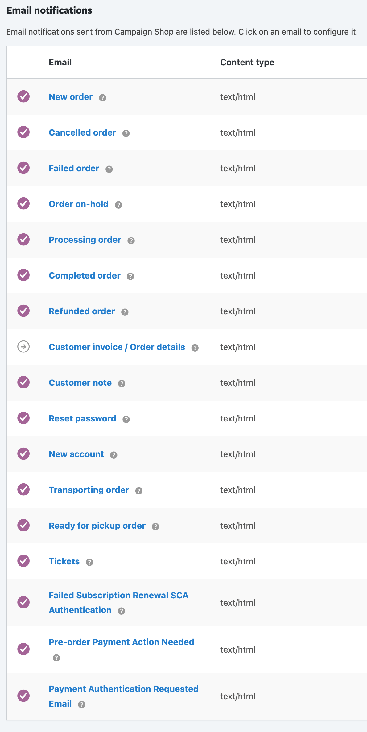
There’s a lot of email automation happening on this website. Of course, an email can be created to respond to any form submission (potentially with variable content using conditional logic). Then, there’s a set of donation-related emails like the thanks (payment confirmed) email, payment failed, refund, recurring donation setup, recurring payment made, recurring payment cancelled, etc. Likewise, there’s also a set of e-commerce emails for shop orders (new, cancelled, processing, shipped, refunded, etc.). For events, there are RSVP/ Ticket emails, which can be customized from the Event setup page in the Admin Dashboard. Scheduled emails (like a reminder or any other relevant content) can also be sent to attendees of a specific event. Custom emails can even be triggered when event attendees check in at the event by scanning the unique QR code from their RSVP or ticket email.
Email is a big component of what makes this digital strategy framework effective.
By consolidating all of this functionality into one website — Native Forms & Fundraising, Events, and E-Commerce — the campaign gets complete control over all email automation. That’s not only great for brand consistency, but it also means being able to get more sophisticated with email strategy. Like, custom dynamic list segments with a series of drip emails, or scheduled follow-ups after an event action or product purchase. It’s pretty simple— a better email operation will increase engagement, recruit more active & committed volunteers, and raise more money.
User accounts open up a whole new world of possibilities when it comes to the user experience and functionality available on a campaign website. When a user is logged in, they can save basic info like name, address, etc., and then forms can be auto-filled with whatever information they have saved. That means one-click event RSVPs and other form submissions, including donations. They’ll also breeze through the shop checkout without having to fill out any forms again. Users can even save credit & debit cards to use in the e-commerce checkout process (for shop items and event tickets). While the shop checkout and donation forms both use Stripe to process transactions, they are different payment gateways and work a little differently (so, the donation forms don’t yet use quickpay buttons or saved cards, but I’m working on it!).
You can incentivize users to activate accounts in different ways, whether it’s access to exclusive content or virtual events, special coupons for the shop, or other tactics.
User Roles With Access to the Admin Dashboard
The other aspect to user accounts are the admin user roles. These have different levels of permissions and capabilities in the admin dashboard. For example, there’s the Site-Admin, who gets access to all the features they need to manage the website and their users. Then there are specialized roles, like SEO Manager, Shop Manager, Events Organizer, Content Contributor, etc. This way, the campaign can give website access to anyone who needs it, but can restrict their access and capabilities so that things don’t get messed up.
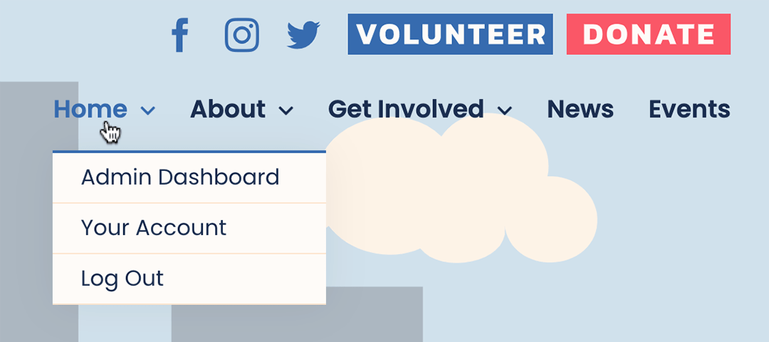
A small example of contextual content— if a user with any level of admin privileges is logged in, an “Admin Dashboard” link will appear in the website’s top navigation menu. For all other users, this menu item does not exist.
It’s worthwhile to see the custom Admin Dashboard for yourself with Site-Admin privileges (particularly if you’re familiar with WordPress). I won’t bother presenting a comprehensive documentation of the admin features but you can login here to have a look around the dashboard if you’d like. Use the same login as before, but note that this is just a staging site of the live meraformetro site— these user credentials won’t get you into the live website’s dashboard.
Analytics data is central to how and why this whole framework is designed, and so it’s an important topic to include on this page. But, this whole presentation has gotten pretty long and I’m sure you’re ready for it to be over. So let’s just bullet-point this one.
- Tag Manager implementation
- Event tracking, like for form submissions, video views, scroll depth, link clicks, etc.
- Custom goals
- Multi-channel funnels and conversion attribution
- Enhanced e-commerce analytics
- Search Console integration
- Advertising platform integrations
- Retargeting tags for custom audiences
- Enhanced data layer with custom dimensions
- Custom Reporting Dashboards
Digital strategy isn’t a guessing game. It’s critical to have the fullest possible picture of the website’s user data in order to make data-informed strategic decisions. Analytics reporting is central to optimization, and yet many campaigns are too often ignoring it completely.
This isn’t that big of a deal, but I might as well point it out. This page is included for everyone on the campaign to reference. When you have multiple people creating graphics for social media, direct mail pieces, video, or really anything with color, it’s important to maintain a consistent visual identity across all channels and media.
And yes, I made that dynamic eyedropper cursor, which fills with whatever color you select to copy to the clipboard. Because why not?
Responsive design isn’t a “special” feature, of course. But if you’d like to see what the site looks like on mobile without having to pull it up on a different device, here’s a full-sized mobile mockup for you.
That being said, there are some cool features for responsive design in the admin dashboard page builder, but let’s save that for another demo.

Leave A Comment